a.heateor_sss_amp{padding:0 4px;}div.heateor_sss_horizontal_sharing a amp-img{display:inline-block;}.heateor_sss_amp_gab img{background-color:#25CC80}.heateor_sss_amp_parler img{background-color:#892E5E}.heateor_sss_amp_gettr img{background-color:#E50000}.heateor_sss_amp_instagram img{background-color:#624E47}.heateor_sss_amp_yummly img{background-color:#E16120}.heateor_sss_amp_youtube img{background-color:#ff0000}.heateor_sss_amp_teams img{background-color:#5059c9}.heateor_sss_amp_google_translate img{background-color:#528ff5}.heateor_sss_amp_x img{background-color:#2a2a2a}.heateor_sss_amp_rutube img{background-color:#14191f}.heateor_sss_amp_buffer img{background-color:#000}.heateor_sss_amp_delicious img{background-color:#53BEEE}.heateor_sss_amp_rss img{background-color:#e3702d}.heateor_sss_amp_facebook img{background-color:#0765FE}.heateor_sss_amp_perplexity img{background-color:#165962}.heateor_sss_amp_claude img{background-color:#D97757}.heateor_sss_amp_google_ai img{background-color:#000}.heateor_sss_amp_grok img{background-color:#000}.heateor_sss_amp_chatgpt img{background-color:#000}.heateor_sss_amp_digg img{background-color:#006094}.heateor_sss_amp_email img{background-color:#649A3F}.heateor_sss_amp_float_it img{background-color:#53BEEE}.heateor_sss_amp_linkedin img{background-color:#0077B5}.heateor_sss_amp_pinterest img{background-color:#CC2329}.heateor_sss_amp_print img{background-color:#FD6500}.heateor_sss_amp_reddit img{background-color:#FF5700}.heateor_sss_amp_mastodon img{background-color:#6364FF}.heateor_sss_amp_stocktwits img{background-color: #40576F}.heateor_sss_amp_mewe img{background-color:#007da1}.heateor_sss_amp_mix img{background-color:#ff8226}.heateor_sss_amp_tumblr img{background-color:#29435D}.heateor_sss_amp_twitter img{background-color:#55acee}.heateor_sss_amp_vkontakte img{background-color:#0077FF}.heateor_sss_amp_yahoo img{background-color:#8F03CC}.heateor_sss_amp_xing img{background-color:#00797D}.heateor_sss_amp_instagram img{background-color:#527FA4}.heateor_sss_amp_whatsapp img{background-color:#55EB4C}.heateor_sss_amp_aim img{background-color: #10ff00}.heateor_sss_amp_amazon_wish_list img{background-color: #ffe000}.heateor_sss_amp_aol_mail img{background-color: #2A2A2A}.heateor_sss_amp_app_net img{background-color: #5D5D5D}.heateor_sss_amp_balatarin img{background-color: #fff}.heateor_sss_amp_bibsonomy img{background-color: #000}.heateor_sss_amp_bitty_browser img{background-color: #EFEFEF}.heateor_sss_amp_blinklist img{background-color: #3D3C3B}.heateor_sss_amp_blogger_post img{background-color: #FDA352}.heateor_sss_amp_blogmarks img{background-color: #535353}.heateor_sss_amp_bookmarks_fr img{background-color: #E8EAD4}.heateor_sss_amp_box_net img{background-color: #1A74B0}.heateor_sss_amp_buddymarks img{background-color: #ffd400}.heateor_sss_amp_care2_news img{background-color: #6EB43F}.heateor_sss_amp_comment img{background-color: #444}.heateor_sss_amp_diary_ru img{background-color: #E8D8C6}.heateor_sss_amp_diaspora img{background-color: #2E3436}.heateor_sss_amp_dihitt img{background-color: #FF6300}.heateor_sss_amp_diigo img{background-color: #4A8BCA}.heateor_sss_amp_douban img{background-color: #497700}.heateor_sss_amp_draugiem img{background-color: #ffad66}.heateor_sss_amp_evernote img{background-color: #8BE056}.heateor_sss_amp_facebook_messenger img{background-color: #0084FF}.heateor_sss_amp_fark img{background-color: #555}.heateor_sss_amp_fintel img{background-color: #087515}.heateor_sss_amp_flipboard img{background-color: #CC0000}.heateor_sss_amp_folkd img{background-color: #0F70B2}.heateor_sss_amp_google_news img{background-color: #4285F4}.heateor_sss_amp_google_classroom img{background-color: #FFC112}.heateor_sss_amp_google_gmail img{background-color: #E5E5E5}.heateor_sss_amp_hacker_news img{background-color: #F60}.heateor_sss_amp_hatena img{background-color: #00A6DB}.heateor_sss_amp_instapaper img{background-color: #EDEDED}.heateor_sss_amp_jamespot img{background-color: #FF9E2C}.heateor_sss_amp_kakao img{background-color: #FCB700}.heateor_sss_amp_kik img{background-color: #2A2A2A}.heateor_sss_amp_kindle_it img{background-color: #2A2A2A}.heateor_sss_amp_known img{background-color: #fff101}.heateor_sss_amp_line img{background-color: #00C300}.heateor_sss_amp_livejournal img{background-color: #EDEDED}.heateor_sss_amp_mail_ru img{background-color: #356FAC}.heateor_sss_amp_mendeley img{background-color: #A70805}.heateor_sss_amp_meneame img{background-color: #FF7D12}.heateor_sss_amp_mixi img{background-color: #EDEDED}.heateor_sss_amp_myspace img{background-color: #2A2A2A}.heateor_sss_amp_netlog img{background-color: #2A2A2A}.heateor_sss_amp_netvouz img{background-color: #c0ff00}.heateor_sss_amp_newsvine img{background-color: #055D00}.heateor_sss_amp_nujij img{background-color: #D40000}.heateor_sss_amp_odnoklassniki img{background-color: #F2720C}.heateor_sss_amp_oknotizie img{background-color: #fdff88}.heateor_sss_amp_outlook_com img{background-color: #0072C6}.heateor_sss_amp_papaly img{background-color: #3AC0F6}.heateor_sss_amp_pinboard img{background-color: #1341DE}.heateor_sss_amp_plurk img{background-color: #CF682F}.heateor_sss_amp_pocket img{background-color: #ee4056}.heateor_sss_amp_polyvore img{background-color: #2A2A2A}.heateor_sss_amp_printfriendly img{background-color: #61D1D5}.heateor_sss_amp_protopage_bookmarks img{background-color: #413FFF}.heateor_sss_amp_pusha img{background-color: #0072B8}.heateor_sss_amp_qzone img{background-color: #2B82D9}.heateor_sss_amp_refind img{background-color: #1492ef}.heateor_sss_amp_rediff_mypage img{background-color: #D20000}.heateor_sss_amp_renren img{background-color: #005EAC}.heateor_sss_amp_segnalo img{background-color: #fdff88}.heateor_sss_amp_sina_weibo img{background-color: #ff0}.heateor_sss_amp_sitejot img{background-color: #ffc800}.heateor_sss_amp_skype img{background-color: #00AFF0}.heateor_sss_amp_sms img{background-color: #6ebe45}.heateor_sss_amp_slashdot img{background-color: #004242}.heateor_sss_amp_stumpedia img{background-color: #EDEDED}.heateor_sss_amp_svejo img{background-color: #fa7aa3}.heateor_sss_amp_symbaloo_feeds img{background-color: #6DA8F7}.heateor_sss_amp_telegram img{background-color: #3DA5f1}.heateor_sss_amp_trello img{background-color: #1189CE}.heateor_sss_amp_tuenti img{background-color: #0075C9}.heateor_sss_amp_twiddla img{background-color: #EDEDED}.heateor_sss_amp_typepad_post img{background-color: #2A2A2A}.heateor_sss_amp_viadeo img{background-color: #2A2A2A}.heateor_sss_amp_viber img{background-color: #8B628F}.heateor_sss_amp_wordpress img{background-color: #464646}.heateor_sss_amp_wykop img{background-color: #367DA9}.heateor_sss_amp_yahoo_mail img{background-color: #400090}.heateor_sss_amp_yahoo_messenger img{background-color: #400090}.heateor_sss_amp_youmob img{background-color: #3B599D}.heateor_sss_amp_gentlereader img{background-color: #46aecf}.heateor_sss_amp_threema img{background-color: #2A2A2A}.heateor_sss_amp_bluesky img{background-color:#0085ff}.heateor_sss_amp_threads img{background-color:#000}.heateor_sss_amp_raindrop img{background-color:#0b7ed0}.heateor_sss_amp_micro_blog img{background-color:#ff8800}/** * Jetpack related posts */ /** * The Gutenberg block */ .jp-related-posts-i2 { margin-top: 1.5rem; } .jp-related-posts-i2__list { --hgap: 1rem; display: flex; flex-wrap: wrap; column-gap: var(--hgap); row-gap: 2rem; margin: 0; padding: 0; list-style-type: none; } .jp-related-posts-i2__post { display: flex; flex-direction: column; /* Default: 2 items by row */ flex-basis: calc(( 100% - var(--hgap) ) / 2); } /* Quantity qeuries: see https://alistapart.com/article/quantity-queries-for-css/ */ .jp-related-posts-i2__post:nth-last-child(n+3):first-child, .jp-related-posts-i2__post:nth-last-child(n+3):first-child ~ * { /* From 3 total items on, 3 items by row */ flex-basis: calc(( 100% - var(--hgap) * 2 ) / 3); } .jp-related-posts-i2__post:nth-last-child(4):first-child, .jp-related-posts-i2__post:nth-last-child(4):first-child ~ * { /* Exception for 4 total items: 2 items by row */ flex-basis: calc(( 100% - var(--hgap) ) / 2); } .jp-related-posts-i2__post-link { display: flex; flex-direction: column; row-gap: 0.5rem; width: 100%; margin-bottom: 1rem; line-height: 1.2; } .jp-related-posts-i2__post-link:focus-visible { outline-offset: 2px; } .jp-related-posts-i2__post-img { order: -1; max-width: 100%; } .jp-related-posts-i2__post-defs { margin: 0; list-style-type: unset; } /* Hide, except from screen readers */ .jp-related-posts-i2__post-defs dt { position: absolute; width: 1px; height: 1px; overflow: hidden; clip-path: inset(50%); white-space: nowrap; } .jp-related-posts-i2__post-defs dd { margin: 0; } /* List view */ .jp-relatedposts-i2[data-layout="list"] .jp-related-posts-i2__list { display: block; } .jp-relatedposts-i2[data-layout="list"] .jp-related-posts-i2__post { margin-bottom: 2rem; } /* Breakpoints */ @media only screen and (max-width: 640px) { .jp-related-posts-i2__list { display: block; } .jp-related-posts-i2__post { margin-bottom: 2rem; } } /* Container */ #jp-relatedposts { display: none; padding-top: 1em; margin: 1em 0; position: relative; clear: both; } .jp-relatedposts::after { content: ""; display: block; clear: both; } /* Headline above related posts section, labeled "Related" */ #jp-relatedposts h3.jp-relatedposts-headline { margin: 0 0 1em 0; display: inline-block; float: left; font-size: 9pt; font-weight: 700; font-family: inherit; } #jp-relatedposts h3.jp-relatedposts-headline em::before { content: ""; display: block; width: 100%; min-width: 30px; border-top: 1px solid rgba(0, 0, 0, 0.2); margin-bottom: 1em; } #jp-relatedposts h3.jp-relatedposts-headline em { font-style: normal; font-weight: 700; } /* Related posts items (wrapping items) */ #jp-relatedposts .jp-relatedposts-items { clear: left; } #jp-relatedposts .jp-relatedposts-items-visual { margin-right: -20px; } /* Related posts item */ #jp-relatedposts .jp-relatedposts-items .jp-relatedposts-post { float: left; width: 33%; margin: 0 0 1em; /* Needs to be same as the main outer wrapper for Related Posts */ box-sizing: border-box; } #jp-relatedposts .jp-relatedposts-items-visual .jp-relatedposts-post { padding-right: 20px; filter: alpha(opacity=80); -moz-opacity: 0.8; opacity: 0.8; } #jp-relatedposts .jp-relatedposts-items .jp-relatedposts-post:nth-child(3n+4), #jp-relatedposts .jp-relatedposts-items-visual .jp-relatedposts-post:nth-child(3n+4) { clear: both; } #jp-relatedposts .jp-relatedposts-items .jp-relatedposts-post:hover .jp-relatedposts-post-title a { text-decoration: underline; } #jp-relatedposts .jp-relatedposts-items .jp-relatedposts-post:hover { filter: alpha(opacity=100); -moz-opacity: 1; opacity: 1; } /* Related posts item content */ #jp-relatedposts .jp-relatedposts-items-visual h4.jp-relatedposts-post-title, #jp-relatedposts .jp-relatedposts-items p, #jp-relatedposts .jp-relatedposts-items time { font-size: 14px; line-height: 20px; margin: 0; } #jp-relatedposts .jp-relatedposts-items-visual .jp-relatedposts-post-nothumbs { position: relative; } #jp-relatedposts .jp-relatedposts-items-visual .jp-relatedposts-post-nothumbs a.jp-relatedposts-post-aoverlay { position: absolute; top: 0; bottom: 0; left: 0; right: 0; display: block; border-bottom: 0; } #jp-relatedposts .jp-relatedposts-items p, #jp-relatedposts .jp-relatedposts-items time { margin-bottom: 0; } #jp-relatedposts .jp-relatedposts-items-visual h4.jp-relatedposts-post-title { text-transform: none; margin: 0; font-family: inherit; display: block; max-width: 100%; } #jp-relatedposts .jp-relatedposts-items .jp-relatedposts-post .jp-relatedposts-post-title a { font-size: inherit; font-weight: 400; text-decoration: none; filter: alpha(opacity=100); -moz-opacity: 1; opacity: 1; } #jp-relatedposts .jp-relatedposts-items .jp-relatedposts-post .jp-relatedposts-post-title a:hover { text-decoration: underline; } #jp-relatedposts .jp-relatedposts-items .jp-relatedposts-post img.jp-relatedposts-post-img, #jp-relatedposts .jp-relatedposts-items .jp-relatedposts-post span { display: block; max-width: 90%; overflow: hidden; text-overflow: ellipsis; } #jp-relatedposts .jp-relatedposts-items-visual .jp-relatedposts-post img.jp-relatedposts-post-img, #jp-relatedposts .jp-relatedposts-items-visual .jp-relatedposts-post span { height: auto; max-width: 100%; } #jp-relatedposts .jp-relatedposts-items .jp-relatedposts-post .jp-relatedposts-post-date, #jp-relatedposts .jp-relatedposts-items .jp-relatedposts-post .jp-relatedposts-post-context { opacity: 0.6; } /* Hide the date by default, but leave the element there if * a theme wants to use css to make it visible. */ .jp-relatedposts-items .jp-relatedposts-post .jp-relatedposts-post-date { display: none; } /* Behavior when there are thumbnails in visual mode */ #jp-relatedposts .jp-relatedposts-items-visual div.jp-relatedposts-post-thumbs p.jp-relatedposts-post-excerpt { display: none; } /* Behavior when there are no thumbnails in visual mode */ #jp-relatedposts .jp-relatedposts-items-visual .jp-relatedposts-post-nothumbs p.jp-relatedposts-post-excerpt { overflow: hidden; } #jp-relatedposts .jp-relatedposts-items-visual .jp-relatedposts-post-nothumbs span { margin-bottom: 1em; } /* List Layout */ #jp-relatedposts .jp-relatedposts-list .jp-relatedposts-post { clear: both; width: 100%; } #jp-relatedposts .jp-relatedposts-list .jp-relatedposts-post img.jp-relatedposts-post-img { float: left; overflow: hidden; max-width: 33%; margin-right: 3%; } #jp-relatedposts .jp-relatedposts-list h4.jp-relatedposts-post-title { display: inline-block; max-width: 63%; } /* * Responsive */ @media only screen and (max-width: 640px) { #jp-relatedposts .jp-relatedposts-items .jp-relatedposts-post { width: 50%; } #jp-relatedposts .jp-relatedposts-items .jp-relatedposts-post:nth-child(3n) { clear: left; } #jp-relatedposts .jp-relatedposts-items-visual { margin-right: 20px; } } @media only screen and (max-width: 320px) { #jp-relatedposts .jp-relatedposts-items .jp-relatedposts-post { width: 100%; clear: both; margin: 0 0 1em; } #jp-relatedposts .jp-relatedposts-list .jp-relatedposts-post img.jp-relatedposts-post-img, #jp-relatedposts .jp-relatedposts-list h4.jp-relatedposts-post-title { float: none; max-width: 100%; margin-right: 0; } } /* * Hide the related post section in the print view of a post */ @media print { .jp-relatedposts { display: none !important; } } .wp-block-jetpack-rating-star span.screen-reader-text { border: 0; clip-path: inset(50%); height: 1px; margin: -1px; overflow: hidden; padding: 0; position: absolute; width: 1px; word-wrap: normal; }

Site icon Club Innovation & Culture CLIC France

Quand les collections du Musée d’Archéologie nationale de St Germain en Laye inspirent des musiciens contemporains

Partager :
Temps de lecture : 5 min

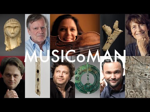
Comment la création contemporaine peut-elle s’inspirer de l’archéologie et tisser ainsi un lien entre nous et nos ancêtres ? MUSICoMAN est une production musicale et audiovisuelle inspirée des collections du Musée d’Archéologie nationale (MAN) en tant que lieu protecteur de l’histoire, écrin des origines, du patrimoine de l’humanité, à  travers une mise en valeur par la musique d’objets emblématiques et symboliques de ses collections et de ses espaces. Cinq compositeurs et 5 musiciens revisitent 5 objets du musée. La web-série en 6 épisodes est diffusée du 29 janvier au 9 avril 2023 avant un concert live présenté à  Versailles et un film documentaire proposé sur la chaine YouTube de l’ensemble Calliopée, initiateur du projet.

Le projet MUSICoMAN imaginé par l’Ensemble Calliopée, et conduit par Karine Lethiec, alto et directrice artistique, a été mené dans le cadre d’un partenariat scientifique avec le Musée d’Archéologie nationale (MAN) – Domaine national de Saint-Germain-en-Laye.

Fruit de cette rencontre inédite entre musique et archéologie, une création audiovisuelle est conçue, incluant également un contenu scientifique et devient un support de médiation de ce projet, diffusé sous divers formats numériques, web-série en six épisodes (un objet archéologique – une création musicale), film documentaire, teasers, création vidéo accompagnant le live.

Ce nouvel outil numérique devient un ambassadeur des collections et de leur l’histoire autant que des créations musicales. Il permet de créer également une diffusion et des actions culturelles innovantes autour de Musique-Archéologie-Création mêlant concert in situ et vidéo, et de tisser des liens vers des nouveaux publics. Les représentations sont conçues dans un format adapté, à  géométrie variable, avec support de vidéo qui plonge le public dans l’univers visuel du MAN, en regard de l’expérience d’écoute.

« Ce projet souhaite ainsi participer à  l’incitation à  la découverte de la création artistique et du patrimoine, à  la fréquentation des lieux de création et de diffusion artistiques autant que des musées d’histoire, à  travers la mise en relation avec les différents champs du savoir et ainsi contribuer à  réduire les inégalités en matière d’accès à  l’art et à  la culture » explique le Musée d’Archéologie nationale €“ Domaine national de Saint-Germain-en-Laye.

Cinq artistes contemporains Graciane Finzi, Philippe Hersant, KryÅ¡tof MaÅ™atka, Benoà®t Menut, Philippe Schœller, inspirés par la recherche sur les origines, portent un regard sur l’archéologie à  travers des créations autour de l’alto, commandes de l’Ensemble Calliopée.

Ils ont créé €“ chacun à  leur manière €“ une œuvre musicale, en écho à  ces objets des premiers êtres de l’humanité, tissant ainsi un lien entre ce monde des hommes et femmes d’il y a 10 000 à  40 000 ans et nous.

L’altiste Karine Lethiec et 4 musiciens de l’Ensemble Calliopée les restituent au sein même du musée. L’équipe de réalisation audiovisuelle 3foisC capte ces moments magiques et ces lieux habités d’Histoire.

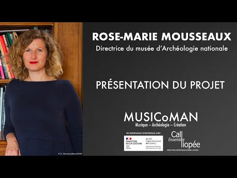
Dans la vidéo ci-dessous, Rose-Marie Mousseaux, directrice du Musée d’Archéologie nationale €“ Domaine national de Saint-Germain-en-Laye, présente ce projet construit dans le cadre d’un partenariat scientifique issu d’une résidence de l’Ensemble Calliopée et de sa directrice artistique Karine Lethiec depuis 2018.

Le projet fait l’objet de plusieurs contenus complémentaires diffusés depuis le 29 janvier 2023.

. web-série en 6 épisodes, du 29 janvier au 9 avril 2023

Chaque séquence vidéo présente 1 œuvre musicale associée 1 objet archéologique.

Les 6 épisodes sont mis progressivement en ligne sur la chaine Youtube de l’ensemble.

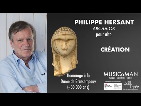
1er épisode de la web-série « Archaios de Philippe Hersant – Alto, Karine Lethiec – Ensemble Calliopée » :

. le film documentaire

« Comment la création d’aujourd’hui peut s’inspirer de l’archéologie et tisser ainsi un lien entre nous et les humains du passé ? Une plongée au cœur du monde sonore et visuel de ces 6 créations ». Avec des interviews des compositeurs, de Karine Lethiec et de Rose-Marie Mousseaux.

Le film documentaire est disponible le 23 avril 2023 sur la chaine YouTube de l’ensemble.

MUSICoMAN fait aussi l’objet d’une création au thé tre Montansier de Versailles. Le concert associe musique et vidéo, et sera donné pour la première fois le 10 mai 2023 à  20h30.

« 1777 €¦ naissance d’un thé tre et naissance d’un alto €¦ une histoire racontée par l’altiste Karine Lethiec avec son instrument qui nous mène, en musique, de l’inauguration par Marie-Antoinette du Montansier au ch teau de Saint-Germain-en-Laye qui accueille le MAN, Musée d’Archéologie Nationale, écrin des origines et des premières émotions ».

Un CD est également publié sous le label Arion Music.

L’Ensemble propose d’autres actions culturelles (réseaux musical et archéologique), des rencontres, échanges, ateliers et des présentations pédagogiques musicales et archéologiques.

Une mise à  disposition gratuite des 6 vidéos, des rédactionnels, des ressources et du film est possible pour une école, un collège, une université, un musée, une médiathèque, une bibliothèque, un hôpital, un centre social, un festival, un conservatoire ou un centre d’animations.

Le projet a été développé en partenariat avec le musée d’Archéologie nationale €“ Domaine national de Saint-Germain-en-Laye, avec le soutien de l’ONDA, Office National de Diffusion Artistique dans le cadre du dispositif à‰cran vivant, de la Sacem, de la Maison de la Musique Contemporaine et des à‰ditions Musicales Artchipel.

Les 6 épisodes de la web-série sont diffusés du 29 janvier au 9 avril 2023.

. Dimanche 29 janvier 2023 : 1er épisode. Philippe Hersant, Archaios pour alto / CRà‰ATION
Hommage à  la Dame de Brassempouy, une des premières représentations d’un visage humain (-30 000 ans)

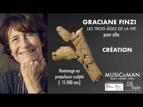
. Dimanche 12 février 2023 : 2e épisode. Graciane Finzi, Les trois ges de la vie pour alto / CRà‰ATION
Hommage au propulseur sculpté à  3 têtes de chevaux (-15 000 ans)

. Dimanche 26 février 2023 : 3e épisode. KryÅ¡tof MaÅ™atka, Altotem-musique archaà¯que nocturne pour alto
avec accompagnement de harpe / CRà‰ATION
Hommage au MAN, musée totem protecteur de notre histoire

. Dimanche 12 mars 2023 : 4e épisode. Benoit Menut, Ar men pour alto
Hommage à  la dalle gravée de Saint-Bélec, première carte topographique présumée (-4 000 ans)

. Dimanche 26 mars 2023 : 5e épisode. KryÅ¡tof MaÅ™atka, Sono Sapiens, duo pour alto et ensemble de flà»tes d’Isturitz, premiers instruments de musique préhistorique / CRà‰ATION (-35 000 ans)

. Dimanche 9 avril 2023 : 6e épisode. Philippe Schœller, Alliage d’Airain / CRà‰ATION
Hommage à  l’ ge du Bronze (-2 000 ans).

Pour toute demande sur ce projet: Karine Lethiec, Directrice artistique de l’Ensemble Calliopée
Tel 06 12 73 14 26 karinelethiec@gmail.com
Marion Cornière, Administratrice de l’Ensemble Calliopée
Tel 06 47 24 18 35 administration@ensemblecalliopee.com
Lauriane Theullier, Chargée de communication et de diffusion
Tel 06 19 17 67 65 communication@ensemblecalliopee.com
www.ensemblecalliopee.com

ensemblecalliopee.com/musicoman/

SOURCES: Musée d’Archéologie nationale €“ Domaine national de Saint-Germain-en-Laye, Ensemble Calliopee

PHOTOS: Musée d’Archéologie nationale €“ Domaine national de Saint-Germain-en-Laye, Ensemble Calliopee r ©RMN-GP (MAN)

Date de première publication: 15/02/2023

Le Musée d’Archéologie nationale €“ Domaine national de Saint-Germain-en-Laye est membre du CLIC

Quitter la version mobile